Web design is a dynamic and critical discipline central to the digital age. As a cornerstone of modern communication and business, it is an art and a science of presenting content in a manner that is both appealing and functional, creating meaningful interactions for its users. This exploration of web design principles provides a comprehensive insight into the fundamental aspects of web design, the significance of visual and functional elements, key best practices to optimize user engagement, and the critical importance of responsive design in today’s multi-device world.
Basics of Web Design
Understanding Web Design
Web design refers to the process of creating visually appealing and functionally effective websites. This process requires the utilization of several disciplines, including graphic design, coding, user experience design, and search engine optimization. The ultimate aim of web design is to produce a user-friendly interface that delivers desired information or services to end users.
Common Web Design Terms
There exist several common terms related to web design that are important to understand:
- HTML (HyperText Markup Language): This is a markup language used to structure the content on the web.
- CSS (Cascading Style Sheets): This is used to describe how the HTML elements should be displayed visually.
- JavaScript: This scripting language is used to create dynamic content on websites.
- Responsive Web Design: This principle involves designing websites in a way that ensures they look and function well on a range of devices, from mobile phones to desktop computers.
- User Interface (UI): This refers to the graphical layout of a website. It includes the buttons users click on, the text they read, the images, sliders, forms, and all the rest of the items the user interacts with.
- User Experience (UX): This refers to the overall experience a user has while navigating a website, including how easy or pleasing the site is to use.
Roles of Web Designers
Web designers play several roles, including creating the layout, visual theme, and interface of a website. They also ensure the website is user-friendly, easy to navigate, and aesthetically appealing. In addition, web designers may have to work with other professionals like content writers and developers to create a fully functional and engaging website.
Web Design Practices
There are several practiced principles in the field of Web design, typically split between technical and aesthetic considerations. Technical practices often revolve around efficiency – making sure a site loads quickly and functions as expected. This may involve optimizing images, compressing files, and ensuring compatibility with different web browsers.
Aesthetic practices, on the other hand, focus on the visual appeal and usability of the site. This can include everything from typography and colour schemes, to the arrangement of elements on the page.
Understanding the Role of Aesthetics in Web Design
In the boundless arena of the internet, a well-designed website, as well as appealing visuals attracts visitors and entices them to linger. The ability to incorporate pleasing aesthetics in web design levels up user experience, conveys a positive image of your brand, and predominantly contributes to increased conversion rates. It’s essential to create a balance between the different elements, ensuring they meld together to foster an intuitive and engaging interaction with the user. Thoughtfully chosen typography, harmonious color palettes, and strategic application of white space and imagery can all yield positive results in this regard.
Moreover, ‘visual cues’ serves as an example of how aesthetics can merge with usability. These design constituents guide the user smoothly through your site, signposting interactive elements, directing next steps, or suggesting the functionality of various features. Incorporation of these design strategies can streamline the user experience, heighten enjoyment, and significantly bolster user engagement.
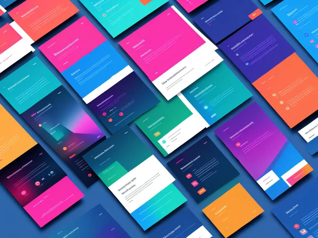
Visual Elements in Web Design
Interplay of Visual Elements in Web Design
To create an effective and visually enticing web design, visual elements have a powerful impact. Collectively, these encompass the use of color, typography, imagery, and the arrangement of these on a webpage.
Color in Web Design
Color is a critical component of web design as it helps to set the mood or tone of a website, can influence user behavior, and helps to create a brand identity. Choosing the right color scheme can enhance the user experience, evoke emotions and lead to the website’s overall success. Color theory and color psychology are often employed in web design to elicit specific reactions or behaviors from users. Different colors can evoke various emotions; for example, warm colors like red, orange, and yellow can create a sense of urgency while cooler colors like blue, green, and purple tend to be calming and reassuring. Furthermore, color contrast is used to draw attention and make the content easily readable.
Typography in Web Design
Typography is equally important in web design. This involves the selection and application of font type, size, color, and spacing. Good typography enhances the website’s readability and accessibility, and keeps the user engaged with the content. The font choice can also reflect the brand’s personality. For instance, a professional website might use a traditional serif font, while a more creative or modern site might opt for a playful or avant-garde typeface. Furthermore, typography shouldn’t just be aesthetically pleasing — it should also be web-friendly and render well on various devices, including desktops, smartphones, and tablets.
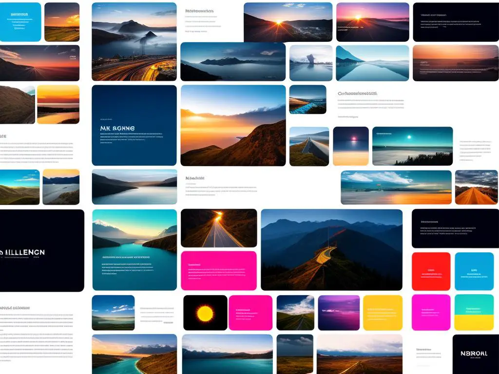
Images in Web Design
Images are an essential part of web design. They can tell a story, set a mood, encapsulate information, or prompt action. Quality images can significantly elevate the aesthetic appeal of a website while also improving user engagement. It is advantageous to use original, high-quality, and relevant images wherever possible. Additionally, images should be optimized for web use to improve load times and overall website performance. Proper usage of alt texts or alternative text descriptions is necessary to make images accessible to all users.
Layout in Web Design
The layout of a website deals with the arrangement of visual elements. This can guide users through the information on a page and influence how they interact with the site. Practical, clean, and organized layouts can improve user experience by making the website easy to navigate and digest. Key principles of great layouts include consistency, balance, alignment, white space, and hierarchy. Grid systems are often used in web design layouts to create structured and consistent designs. The use of white space or negative spacing can help focus attention on key content or calls to action, and create a clean and uncluttered aesthetic.
A Final Thought on Visual Elements
With regards to web design, it’s important to acknowledge how central visual elements are to the overall result. Through careful selection and application of color, typography, images, and layout, not only does the appeal of a website increase, but also its effectiveness and functionality improve. It is critical to remember that these elements are not only about aesthetics, but also play a significant role in shaping the user’s experience.
Functional Elements in Web Design
Moving on to Functionality in Web Design
As we transition from the topic of visuals, let’s address another critical component in web design – functionality aspects. User-friendly navigation, speedy loading times, and mobile compatibility stand out when we discuss functionality. Each of these factors has direct implications on the user experience and consequently, the overall performance of your website cannot be underestimated.
User-Friendly Navigation
Effective and user-friendly navigation is an integral part of any successful web design. Visitors should be able to easily find the information they are looking for, without encountering any roadblocks. This can be facilitated by a clean layout, logical and intuitive menus, and clearly marked sections. Breadcrumbs, which show the trail of visited pages, are another powerful tool that aids navigation.
An organized site map can also play a key role, serving as an index of all important pages on your website. Together, these elements work in harmony to enhance user satisfaction and retain visitor interest, both of which are key indicators of a thriving website.
Website Loading Times
Website loading times, or the speed at which your web pages load, is another crucial aspect of web design functionality. Slow-loading websites not only frustrate users but can also lead to high bounce rates. In fact, research suggests that websites that take longer than three seconds to load can lose nearly half of their visitors.
Several factors contribute to website loading times. These include server speed, web page file sizes, code efficiency, and the number and complexity of elements on each web page. As a web designer, it’s vital to ensure your website is optimized for speed with the help of minified code, compressed media files, and a reliable hosting service.
Mobile Compatibility
With the rise in smartphone usage, web design now needs to take into account mobile compatibility. More and more users are accessing websites on their mobile devices, and designs must be responsive to provide an optimal viewing and interaction experience.
A mobile-friendly website not only scales and adjusts to fit different screen sizes but also incorporates touch control capabilities. This means that the site’s layout, images, and menus should adjust smoothly depending on whether the user is on a desktop, smartphone, or tablet. Responsive design also pays attention to mobile-specific features and behaviors, like the on-screen keyboard and touch navigation.
To be a successful web designer, it’s necessary to constantly pay attention to important functional aspects of your website like its navigability, loading speed, and mobile responsiveness. The result of this diligence is a seamless, enjoyable user experience which is crucial in achieving the ultimate goal – a successful website.
Web Design Principles and Best Practices
Blending Functionality and Aesthetics in Web Design
In web design, a key principle is maintaining a balance between function and aesthetics. Attractive visuals may draw users in but it’s the functionality that keeps them engaged. Functionality is all about the performance of the website, including elements like user-friendly navigation and loading speed. Aesthetics, on the other hand, relates to the visual appeal including color choices, typography, images, and layout. A critical task for a web designer is to ensure that the design enhances the purpose of the web content, rather than distracting from it.
Content Organization in Web Design
A well-organized website enhances usability, making it easier for users to find what they are looking for. Information architecture is at the core of content organization, dictating how information is structured and categorized. A successful web design uses intuitive categorization and clear, concise labels. A dominant practice is to place the most important information at the top or center. Well-defined, consistent categories help users predict where to find information, leading to better user experience.
User Focus in Web Design
Effective web design is user-focused, and understanding the needs and characteristics of the target audience is paramount. User-focused design involves designing intuitive interfaces that users find straightforward to use. It means using familiar design patterns, actionable items are clearly visible, and interactions lead to expected outcomes. Considering aesthetics from the users’ perspective—what appeals to them and what retains their interest—is also an integral part of this principle.
Design Consistency
Consistency in web design ensures a cohesive, predictable, and easily navigable site. It includes maintaining similar layouts, color schemes, fonts, and styling across all pages. Consistency helps users build familiarity with the website, reducing learning time and enhancing user engagement. A standardized navigation menu throughout the site is an effective practice for implementing design consistency.
Best Practices for User Engagement and Retention
Beyond mentioned principles, web design specialists adopt certain best practices to promote user engagement and retention. Clear, concise, and engaging content is a key to keep users interested. In addition, elements such as engaging visuals, interactive features, and multimedia content can significantly enhance user engagement. User personalization, where the website offers personalized content or user-specific recommendations, can improve user retention. Moreover, ensuring the site is mobile-friendly and the design is responsive to different screen sizes is crucial given the widespread use of mobile devices.
Performance and Speed
Today’s internet users expect swift responses. Slow loading times can lead to users abandoning a website. Hence, it’s vital for web designers to prioritize performance and speed. This includes optimizing images, enabling browser caching, and minimizing HTTP requests. Regular speed tests can identify any areas that may be causing slowing loading times.
Accessibility and User Inclusivity
Web design should cater to all user groups, including those with disabilities. This is where principles such as color contrast for enhanced readability, keyboard navigation for those who cannot use a mouse, and alternate text for images (for visually impaired users) come in. Adherence to the guidelines provided by the Web Content Accessibility Guidelines (WCAG) is a good practice in ensuring that a website is accessible to all.
Embracing SEO-friendly Design
When creating a website, one significant factor to bear in mind is the implementation of search engine optimization (SEO) best practices. This could involve the use of proper header tags, alt tags for images, and metatags, which enhance your website’s visibility through improved search engine rankings. Additionally, incorporating elements such as targeted keywords in your content, Google-friendly meta tags, easily navigable XML sitemaps, and SEO-optimized URLs enhances the accessibility of your site to a broad user base.
Understanding and Application of Responsive Design
Adapting to Responsive Design
Moving beyond SEO, another essential web design technique is the application of responsive design—a modern necessity that ensures websites adapt to varying device screens. As more people use smartphones, tablets, and other devices to browse the internet, the demand for web pages to properly fit and function on all screen sizes has grown. With responsive design, web layouts become flexible and fluid through the use of adaptable grids, dynamic layouts, and CSS media queries. These techniques allow your website to adjust its design, layout, and functionalities based on the visitor’s device, ensuring consistency in user experience whether your site is accessed via a desktop computer, mobile phone, tablet, or even a smart TV.
Significance of Responsive Design
The importance of responsive web design cannot be understated in today’s digital world and is regarded as a non-negotiable aspect of web presentation. First, it enhances usability and satisfaction, as visitors can seamlessly navigate and interact with the website on any device. It also saves time and resources by reducing the need to create different versions of the same website for various devices. Additionally, responsive design boosts SEO as search engines like Google favour mobile-friendly sites, thereby improving online visibility and traffic.
Applying Responsive Design Principles
The application of responsive design principles in creating a website involves several key steps. A core tenet is utilizing a fluid grid system. This involves designing the layout of your website in relative units like percentages, rather than absolute units like pixels. As a result, the layout adapts to the screen size it’s being viewed on.
CSS media queries are another crucial component. They allow you to apply different styles depending on a device’s characteristics such as screen width, height, or orientation. For example, a common media query might involve setting a multi-column layout for wider screens and a single column layout for smaller, mobile screens.
Images and multimedia content poses another challenge. The solution lies in making them flexible too, just like the rest of your layout. This can be accomplished through CSS by ensuring images are automatically resized to fit the device screen, known as “flexible images”.
Tools for Creating Responsive Designs
Last, there are various tools and frameworks available to assist in creating responsive designs. Bootstrap is a popular system that offers a grid layout, pre-designed components, and JavaScript plugins. Similarly, Foundation provides a responsive grid and a suite of HTML, CSS, and JavaScript plugins. Alternatively, using a responsive web design editor like Adobe Reflow or Macaw can help to visually design a responsive site.
Remember, the goal is to create a seamless and consistent digital experience across all devices. A well-implemented responsive design eases navigation and interaction, ultimately boosting user satisfaction and engagement.
As the digital marketplace continues to evolve, understanding and implementing the principles of web design becomes pivotal in meeting the ever-changing needs of users. The fusion of aesthetic appeal with functional efficacy, the balance between user-focused design and consistent layouts, and the seamless integration of responsive design across multiple devices – these are just a few of the key principles and practices that define successful web design today. Ultimately, the expansive realm of web design is a journey of continuous learning and adaptation, fueled by creativity, technology, and a profound understanding of user needs and expectations.