In today’s digital age, the structure and design of a website are as important as the content it houses. Users increasingly expect seamless, intuitive website navigation that quickly leads them to the information they’re seeking. This paper delves into the world of website navigation, starting from the basics of different types of navigation—be it top navigation menus, footer menus, or sidebars—to the importance of clear and concise navigation for an improved user experience. It also highlights how to effectively structure a site and discusses the art of navigation design, touching on content organization, breadcrumbs, and user tasks. Furthermore, it sheds light on the essential role of usability testing in creating a user-friendly navigation system, and offers a look into current best practices and trends, drawing lessons from successful website navigation systems.
Understanding Website Navigation Basics
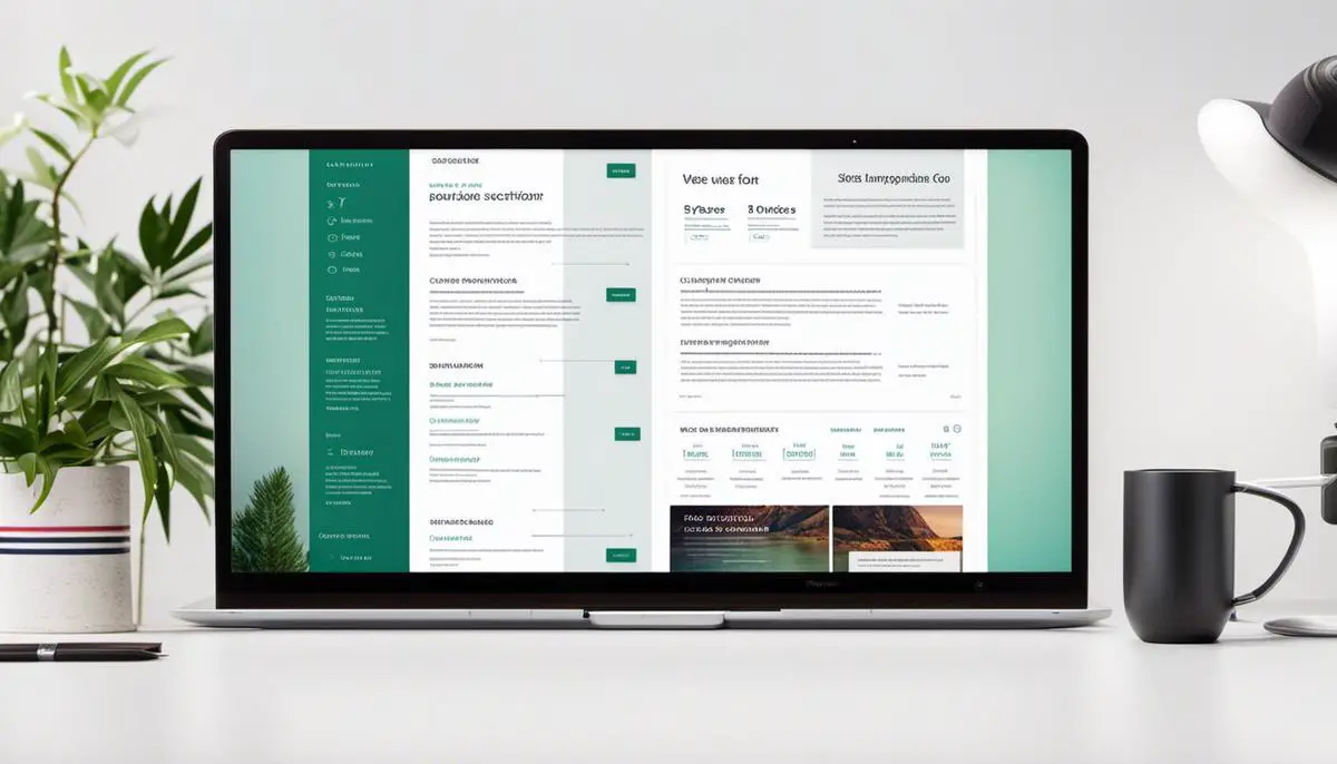
Understanding Different Types of Website Navigation
Website navigation plays a crucial role in enhancing the user experience. It provides a roadmap to your content, promotes usability, and improves search engine ranking. There are three main types of website navigation: top navigation menus, footer menus, and sidebars.
The top navigation menu is the primary tool for visitors to browse through your site. It is usually placed at the top of your webpage and includes links to the most important sections of your website.
Footer menus sit at the bottom of your website and typically include links to secondary pages such as “Contact Us,” “Privacy Policy,” or “Terms of Service.”
Sidebar navigation is often utilized to highlight important information, related links, or sub-menu items relating to a specific category or page.
Importance of Clear and Concise Website Navigation
Clear and concise website navigation aids in improving the user experience on a site. Providing a seamless navigation system enables users to find the information they need quickly. This reduces confusion, leading to better user engagement and satisfaction.
Properly designed navigation enhances the usability of a site by reducing the effort required to find relevant information or functionalities. Users can navigate through your site quickly without needing to backtrack or engage in a deep search.
Site navigation also impacts your search engine optimization performance. A well-structured, easy-to-navigate webpage ranks better on search engines, as it helps search engine bots to crawl your site more effectively and index the content accurately.
Principles of Effective Website Navigation Design
To ensure an effective website navigation system, consider the following principles:
- Keep It Simple: Simplify your navigation menu by limiting the number of items. Too many options can be confusing for visitors.
- Logical Hierarchy: Your menu items should be organized logically, usually in order of importance or in line with user expectations.
- Responsive Design: Make sure your website navigational menus work well on all devices. The trend toward mobile browsing calls for a design that is equally efficient on small screens.
- Clear Labels: Use standard terms for the menu items that help users predict what they will find on clicking.
- Consistent Navigation: Regardless of your website size, the primary navigation should be the same on all pages.
Adhering to these principles fosters a high-quality browsing experience for users, ultimately contributing to improved user engagement, retention, and conversion rates.

Site Structure and Navigation Design
Website Structure Essentials
A balanced website structure is crucial for user experience and search engine optimization. The first step is to understand the basic organization of a website, comprised mainly of the homepage, top-level pages (usually your main navigation menu items), and subpages (usually dropdowns or pages linked to from the top-level pages). It’s critical to ensure that all levels are logically organized, structured for easy navigation.
Decide on the hierarchy and layout of your web pages. Consider using a method called card sorting, where you would write down each piece of content that your website needs to host on individual index cards. Decide on a logical way to sort these cards, thus allowing you to group related content together in a manner that makes sense to your users.
Navigation Design Basics
Effective navigation design allows users to easily find what they’re looking for on your site. Central to this is a clean and intuitive navigation menu. When designing your navigation bar, take into account the number of options it provides, the names for each option, and the order in which they appear. Too many options can overwhelm users, while too few can frustrate them.
The location of your navigation bar matters too. It should be easy to locate, preferably at the top of the page or along the left side. The links should be clear, descriptive, and concise. Moreover, they should accurately represent the content they lead to. Consistency is also key. Your navigation menu should be in the same location on every page.
Creating Breadcrumbs
Breadcrumb navigation is a secondary navigation scheme that reveals the user’s location in a website or web application. Breadcrumbs mirror the structure of the site and provide one-click access to higher site levels.
To create breadcrumbs, start by identifying your page hierarchy. The breadcrumb path should follow this hierarchy. Use the “>” symbol to represent the navigation path and place the breadcrumb trail at the top of the page. It is also important to consider using ‘Home’ as the first level of your breadcrumb trail.
Facilitating User Tasks
A well-structured website facilitates user tasks and engagements. A strategy called ‘progressive disclosure’ can be rather helpful here. Start with the basics and gradually disclose more detailed information as users move deeper into your site.
Additionally, internal linking and calls-to-action (CTAs) guide users on the next steps and keep them engaged. For complex tasks, consider breaking them down into multiple steps laid out in a clear sequence.
A website’s search function is also central in facilitating users’ goals. Users should be able to quickly find items with a conveniently located and efficient search bar.
Last but not least, ensure your site is mobile-friendly. Responsive design ensures the site’s functionality and layout adapt to different screen sizes and devices.

Usability Testing for Navigation
Understanding Website Usability Testing for Navigation
Website usability testing for navigation is an essential part of website development. This process assesses the effectiveness of a website’s navigation system in helping users find the information they need easily and intuitively. Effective navigation ensures users can access the required information or product with the minimum number of clicks, increasing the overall user satisfaction and engagement with the website.
Research Methods for Testing Website Navigation
One common method for conducting usability testing for navigation is user testing. This process involves observing actual users as they navigate the website, using tasks that are representative of typical site use. It allows you to identify any issues or areas where users are having difficulty finding what they need.
Another essential method is card sorting, where users are asked to sort information into categories that make sense to them. This can help you understand how users group information and anticipate their search patterns.
Tree testing is another useful method for testing navigation. Here, users are asked to find information within the site’s information architecture, without the aid of visual design or navigation aids. This helps in analyzing if your site structure is intuitive and easy to understand.
Clickstream analysis can also be a great tool to observe where users click and the paths they take through your site. It can reveal patterns and inform you about potential weak spots in your navigation.
The Importance of Iterative Testing in Website Navigation
In the context of website development, iterative testing refers to the continuous process of developing, testing, refining, and re-testing. It is a cyclical process that facilitates continuous improvement in the website navigation system.
The primary advantage of iterative testing is its potential to uncover and resolve navigation issues early in the development process. By regularly testing and refining the navigation, developers can ensure the system is user-centered and meets the user’s needs and expectations.
Another critical benefit of iterative testing is that it provides a way to measure the impact of changes. By comparing data from different testing cycles, you can quantify the improvements made to the navigation system.
The Goal of an Intuitive and User-friendly Navigation System
The ultimate goal of usability testing for navigation is to create an intuitive and user-friendly navigation system. A good navigation system reduces the user’s cognitive load, which is the mental effort required to navigate a website. The less cognitive load, the easier it is for users to find what they are looking for and have a positive experience with your website.
In conclusion, usability testing for navigation is a critical aspect of website development, involving multiple research methods such as user testing, card sorting, tree testing, and clickstream analysis. The iterative process ensures regular refinement, making navigation more intuitive and user-friendly, increasing user satisfaction and engagement.

Photo by laurenmancke on Unsplash
Best Practices and Trends in Website Navigation
Understanding the Basics of Website Navigation
Website navigation refers to the system that allows visitors to move around a website. This includes the main menu, footer links, and any additional navigational tools. When designing a website, the goal should be to make the visitor’s journey as easy as possible, and that begins with effective navigation.
Website Navigation Best Practices
The first step to designing effective website navigation is to keep it simple. Users should be able to find what they’re looking for quickly and easily, with minimal clicks. Each section of your site should have a clear, descriptive title that accurately represents its contents.
Another essential practice is consistency. The navigational tools and links should be in the same place on every page, making it easier for users to find their way around. Consistency leads to familiarity, and familiarity leads to ease of use.
Use breadcrumbs. Breadcrumbs are a secondary navigation scheme that reveals the user’s location in a website’s structure. They can greatly enhance the way users find their way around.
Ensure that your website is responsive. This means that it should reformat itself for different devices, like tablets and smartphones. Having a responsive design is critical as more people are using mobile devices for internet browsing.
Latest Trends in Website Navigation
In terms of current trends, mega-menus are becoming increasingly popular. Mega-menus are large drop-down menus that display many options in a two-dimensional layout. They can provide a user-friendly, organized way for users to navigate through large websites.
Another recent trend is sticky or fixed navigation, which remains visible at the top of the page no matter how far down a user scrolls. This can make it easier for users to navigate, especially on long pages.
Mobile-first navigation is another trend. As the name suggests, this puts mobile users at the forefront of design considerations, since an increasing number of users are accessing the internet primarily from mobile devices.
Finally, the hidden navigation trend is also on the rise. This design hides the navigation behind a button or icon until the user chooses to view it. It can make the site look cleaner, but it is important to make sure users can easily find the navigation.
Successful Website Navigation Systems
When considering successful navigation systems, Amazon’s website is a solid example. It uses a mega-menu to organize a large amount of content in a user-friendly manner. The website of Apple also successfully uses a simple and consistent navigation system that is easy for users to understand.
By studying these and other successful examples and incorporating their best features into your design, it’s possible to create an effective, user-friendly navigation system. Remember that the true measure of success is a navigation system that users find engaging and easy to use.

The balance between simplicity and sophistication in website navigation can significantly drive or hinder user engagement. Effective navigation systems incorporate a clear structure, thoughtful design, and iterative usability testing. By keeping abreast of the prevailing best practices and trends, web designers can continually improve their skills and create intuitive, aesthetically pleasing navigation that aids users in accomplishing their tasks with ease. Learning from successful website navigation systems can lay the groundwork for innovative navigation strategies that continue to elevate the user experience in the ever-evolving digital landscape.