
In the digital era we inhabit, with the proliferation of varied screen sizes and devices, the importance of mobile responsiveness in web design cannot be overstated. Encompassing a wide array of techniques to ensure an optimal viewing experience across devices of all shapes and sizes, this functionality is a cornerstone requirement for modern web interfaces. Our exploration begins by understanding what mobile responsiveness is and its critical role in current web design trends. Following this, we delve into the key principles behind responsive web design such as fluid grids, flexible images, and media queries, all fundamental for a website to adapt its layout to the viewer’s environment.
Understanding Mobile Responsiveness
Understanding Mobile Responsiveness
Mobile responsiveness is a design strategy that ensures a website’s content and page layout adjust properly to different screen sizes and resolutions. In essence, it is about providing an optimal viewing and interaction experience for users, regardless of the device they are using. This involves elements such as readable text without requiring zoom, adequate space for tap targets, and no horizontal scrolling.
The Importance of Mobile Responsiveness
The critical role of mobile responsiveness stems from the increasingly diverse range of devices today’s users employ to access online content. Users no longer solely rely on standard desktop machines. Instead, they use devices like smartphones, tablets, and different sized laptops, each with a unique screen size and resolution.
Mobile responsiveness is integral in delivering a seamless user experience across these multitude of devices. A site that isn’t mobile responsive can frustrate users and drive them away, whereas a mobile-responsive site can hold visitors’ attention and encourage them to interact more, potentially leading to higher engagement and conversion rates.
Google’s search ranking algorithm also favors mobile responsive websites, making mobile responsiveness not only important for improving user experience but also for enhancing SEO efforts.
Main Aspects of Mobile Responsiveness
- Fluid grids: This concept involves designing a layout with proportionate instead of fixed measurements. The grid ensures the site scales properly to fit any screen size.
- Responsive media: Not just text, media such as images and videos should also resize accordingly to fit in the different dimensions of different devices.
- CSS media queries: These allow website creators to apply different styled CSS to different devices based on features like screen resolution and orientation.
To successfully maintain mobile responsiveness, you need to understand and improve all these aspects of your website. By doing so, you will be able to provide a consistent experience for all users, irrespective of which device they are using.
Responsive Web Design Principles
Understanding Responsive Web Design
Responsive Web Design (RWD) is an approach to design that ensures web pages render (display) well on a variety of devices and window or screen sizes. RWD relies on three key principles: fluid grids, flexible images, and media queries.
Fluid Grids in Responsive Design
Fluid grids are a cornerstone of responsive design. They use relative units instead of absolute units (like pixels) to define the size of elements on a page. Fluid grids enable content to scale and resize seamlessly with the viewport, ensuring the layout adapts seamlessly to different screen sizes. To implement fluid grids:
- Set the maximum width of the design, typically at a size that comfortably accommodates the largest expected viewport.
- Define element widths and margins as percentages rather than static pixel values.
- Test the design at various viewport sizes to ensure elements scale properly.
Flexible Images in Responsive Design
Flexible images, or responsive images, resize and scale to fit within their containing elements. Using flexible images ensures that images don’t stretch or distort as the viewport changes size. Here is how:
- Use CSS max-width property for making images responsive. This CSS rule means images will shrink if needed to fit the screen, but they shouldn’t scale up to be larger than their original size.
- Use image editing software to create and optimize images at appropriate sizes for anticipated viewports.
Media Queries in Responsive Design
Media queries are a powerful tool in HTML and CSS that let you apply specific CSS styles to certain screen sizes. Media queries adapt the design to different viewing environments. Here’s how it works:
- Identify points at which the layout breaks, and create a media query for each. These points are often called breakpoints.
- Within each media query, adjust the CSS to optimize the layout for the corresponding screen size.
- Test the effectiveness of the media queries in different viewport sizes and viewing conditions.
Remember, maintaining mobile responsiveness involves continuous checking and tweaking as new devices and screen sizes emerge. As such, always test your website on different devices and screen widths after making changes to its design.

Using Responsive Design Tools
Understanding Responsive Design Tools
Responsive design tools like Bootstrap and Foundation are created to make your website adapt easily to different devices and screens. They provide ready-made components, such as navigation bars or modals, that automatically adjust to different screen sizes. These tools can simplify the process of building responsive websites and speed up your design process.
Responsive Design with Bootstrap
Starting with Bootstrap, you can download the latest version of it from the official Bootstrap website. Once downloaded and integrated into your project, Bootstrap provides a predefined CSS layout that adapts to different screen sizes, which is referred to as a grid system.
- Include the downloaded CSS and JavaScript files or link directly to Bootstrap’s CDN (Content Delivery Network) to your HTML file.
- Bootstrap grid system consists of containers, rows, and columns. A container enables the bootstrap’s responsive features, the row defines a horizontal block for placing columns, while the column is where you actually place your content.
- Divide your layout to columns within a row according to different screen sizes. Bootstrap’s grid system is based on a 12-column grid, allowing you to make a layout for three distinct devices: mobile phones (less than 768px), tablets (768px to 992px), and desktops (larger than 992px).
For example:
<div class="row">

  <div class="col-12 col-md-8">.col-12 .col-md-8</div>

  <div class="col-6 col-md-4">.col-6 .col-md-4</div>

</div>
Using Responsive Design with Foundation
Foundation, on the other hand, is a responsive front-end framework with a similar approach to responsive design as Bootstrap, but offers more customization options.
- Download the Foundation from its official website, include it in your project in the same way as Bootstrap.
- Foundation uses a predefined CSS layout that is called the Flex Grid and allows not only horizontal alignment like Bootstrap but also vertical alignment.
- The grid system of Foundation also uses a 12-column layout, and you can customize your layout the same way as Bootstrap, just by placing ‘small-‘, ‘medium-‘ or ‘large-‘ before the column number.
For example:
<div class="grid-x grid-padding-x">

  <div class="cell small-6">6 columns</div>

  <div class="cell small-6">6 columns</div>

</div>
Remember that, although these tools provide a good starting point, they are not definitive. It’s essential to always test on various devices to ensure your HTML elements are being displayed as you desire. If you notice any discrepancies, you may need to tweak or add some custom CSS code.

Testing Mobile Responsiveness
Understanding Mobile Responsiveness
Mobile responsiveness refers to the design approach that ensures your website looks and performs optimally on different screen sizes and devices. Given the ever-increasing use of mobile devices for internet access, maintaining mobile responsiveness is crucial for any website.
Manual Testing for Mobile Responsiveness
Manual testing involves adjusting your browser size to simulate different screen sizes. This can be done by dragging the corner of your browser to resize it. As you adjust the size, notice how your website content resizes automatically, repositioning elements to fit the screen. This simple form of testing can give you an idea of how your website performs on different screen sizes.
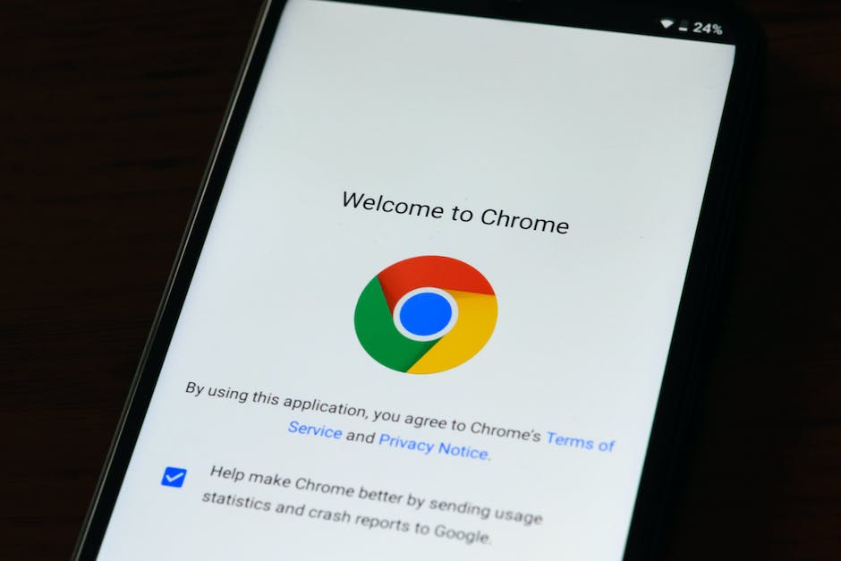
Device Emulation in Chrome Developer Tools
Yet another way to manually test your website’s mobile responsiveness is by using the Developers Tools in Google’s Chrome browser. This powerful tool allows you to emulate different screen sizes and even specific mobile devices.
To use this tool, right-click on your website and select ‘Inspect’. In the panel that opens up, find the ‘Toggle device toolbar’ button and click it. This will let you select from a range of standard screen sizes or specific devices.
Testing on Actual Devices
The most effective manual testing method is on actual devices. If possible, try to test your website on a range of devices, including different models of smartphones, tablets, and desktop computers. This will give you the most accurate idea of how your website performs under real conditions.
Automated Testing for Mobile Responsiveness
There are numerous online tools available for automated testing of your website’s mobile responsiveness. These tools not only simplify the process but also offer a more extensive testing range than manual methods.
Here are several automated tools that you can use:
- Google Mobile-Friendly Test: This tool offers a quick and straightforward way of testing your website. You input your URL, and the tool shows whether your site is mobile-friendly or not.
- BrowserStack: BrowserStack allows you to test your site on real devices without having to own them. It supports testing on different browsers, operating systems, and devices.
- Responsinator: This is a simple tool that shows how your website looks on popular devices. All you need to do is enter your website’s URL.
In conclusion
maintaining and constantly auditing your site’s mobile responsiveness is key in ensuring optimal user experience across different devices. By combining both manual and automated methods, you can identify and fix any issues that might negatively impact your website’s mobile user experience.

Maintaining Mobile Responsiveness
Understand Mobile Responsiveness
Mobile responsiveness ensures your website looks and performs well on various screen sizes and devices. It automatically adjusts the layout, navigation, images, and other elements to fit the screen size. As you update and add new content on your site, maintaining mobile responsiveness is crucial to provide a user-friendly experience to all visitors, whether they use desktops, tablets or smartphones.
Regular Testing and Adjustments
Regularly test your site to ensure that it remains responsive post any updates. Different devices have different resolutions, so it is vital to check your website on several gadgets to verify its layout and functionality. Websites can be tested on actual devices, or you can use online tools and emulation software that replicate different screen sizes. After testing, adjustments might be necessary to maintain responsiveness. Elements like the navigation menu, header, content, and images might need to be resized or rearranged to fit mobile screens while maintaining visual appeal.
Adding New Content with Responsiveness in Mind
When adding new content like images, videos, text, or other website elements, ensure they are mobile-responsive. Upload images and videos that do not have an extremely high resolution, which could slow down loading speed on mobile devices. Use percentage values instead of fixed widths for containers to automatically fit the content according to the screen size. All the new elements added should automatically adjust to different sizes of screens, maintain their functionality, and load quickly.
Responsive Templates and Themes
If you are using a content management system (CMS) like WordPress, Joomla, or Drupal, use responsive themes or templates that automatically adjust for different mobile screens. As you add new pages or areas to your site, ensure that they also use these templates or themes for uniformity and maintaining responsiveness.
Utilize CSS Media Query
CSS Media Queries are a popular technique to maintain mobile responsiveness. They allow you to apply specific CSS styles to your website based on the device’s characteristics, such as the width of the viewport or screen resolution. When updating or adding new style elements to your website, incorporate media queries to ensure these changes align with mobile responsiveness.
Turn to Professional Help
If maintaining mobile responsiveness yourself becomes too complex, consider hiring a web development specialist or a team specifically skilled in responsive web design. They can handle the complexities of adapting your website to the constantly changing landscape of devices and screen sizes.
Stay Informed and Keep Learning
Keep current with the latest trends and techniques in responsive design and mobile technology. What works today may become obsolete tomorrow. Join web development groups online, follow blogs and tutorials, or take online courses to keep updating your skills in maintaining mobile responsiveness.

As we venture forth by using responsive design tools and frameworks such as Bootstrap or Foundation, we learn how these ready-made components adjust to different screen sizes. Testing mobile responsiveness, in turn, will provide us insights on how our website adapts to various devices and browsers. Finally, we tackle maintaining mobile responsiveness while making updates and adding new content to your site, emphasizing the importance of regular testing and ensuring new elements retain their responsiveness. Continually adapting and growing with changing trends and technologies, mobile responsiveness is indeed a dynamic, vital element of contemporary web design.